4 Unit: 4: Images and Colour

In this unit, we provide recommendations to guide your inclusion of accessible, image-based content. After working on this unit, you are expected to be able to:
- Describe the difference between functional and decorative images
- Write an effective image description
- Use a contrast checker to check the accessibility of colour combinations
- Identify alternatives to using colours to convey information

Images can successfully convey complex information, enhance understanding, and improve retention. Images can also engage students more effectively than text (Mayer, 2009).
Our brain decodes visual information much faster than text (Mayer, 2009). Images can support narrative and expository content, as well as show dynamic processes, relationships, computations, and procedures.
Many concepts are communicated more effectively with the addition of illustrations, maps, charts, and other types of visual objects. Images can provide alternate representations of concepts that may be challenging or difficult to convey in text only (for example, imagine anatomy without illustrations or history without maps).
UDL connection
- ·Provide Multiple Means of Engagement: Images can improve retention and understanding, and they can be used to make the text more engaging and relevant.
- Provide Multiple Means of Action and Expression: When assessing students understanding of complex systems and processes, offer the option to have them demonstrate their understanding by creating images, charts, graphs, or maps.
- Provide Multiple Means of Representation: Images can successfully convey complex information, enhance understanding, and improve retention. Images can be used as an alternative to text, audio, or video, or they can be used in addition to these other media types.
![]()
Example

Image attribution: “Plant cell structure” by LadyofHats is in the public domain.
Image description: A 3D diagram of a plant cell. The diagram shows a cross-section of the cell with all of the parts labeled.
This diagram of a plant cell can convey information more efficiently and effectively than text. Images like charts, diagrams, illustrations, and graphs can support the understanding of large complex systems and data more clearly and easily than text.
Optimize Images for Learning
Many concepts are communicated more effectively with the addition of illustrations, maps, charts, and other types of visual objects. Images can provide alternate representations of concepts that may be challenging or difficult to convey in text only (for example, imagine anatomy without illustrations or history without maps).
Research has shown that when graphics and images are used, it can dramatically improve retention; however, the relationship between the image and subject must be relevant and congruent, otherwise, the image can be distracting to the learner. Research also suggests that people learn abstract, new, and novel concepts more easily when they are presented in both verbal and visual form (Clark & Mayer, 2011). When working with images, it is important to understand the complexity, flexibility, and accessibility requirements of the images you use and support the learners’ ability to fully perceive the information (Salomon, 1994).
There is no medium of expression that is equally suited for all learners or for all kinds of communication. Providing alternatives to demonstrate understanding removes barriers for some and providing choices in means of communication engages many (CAST, 2018).
Considerations when choosing or creating images:
- Make sure all images are accessible. We will talk more about image accessibility in the following section
- Follow copyright and attribution guidelines
- Put critical information in the text rather than in the image. If you must have text in an image, make sure it is also represented in an accessible way

Before you can determine what to do to make an image accessible, you must identify its purpose or value the image provides to your students. Consider the following questions:
- Does your image serve a functional purpose? In other words, is it conveying information to your students?
- Does your image serve more of a decorative purpose? In other words, is it primarily a design element or a way to break up the text but does not convey content?
Once that has been decided, text descriptions will have to be written for all functional images. Figures such as charts and graphs that rely on colour to convey information should also be evaluated for accessibility. We will come back to colour accessibility later on.
Who are you doing this for?
This work supports students who:
- Are blind or have low vision, like Jacob
- Have limited Internet access and cannot download images, like Zishan
- Have a cognitive disability

Image description: A white man sits at a desk in front of a computer. He wears sunglass and headphones, and his fingers are on a refreshable Braille display.
Image attribution: Jacob: “WFE003: Jacob” by Rosenfeld Media is under a CC BY 2.0 Licence.

Image description: A South Asian man wearing a backpack.
Image attribution: Zishan by Andrew Fryer is under a CC BY 4.0 Licence.
Decorative Images
If an image does not add information (meaning if it’s included for decorative or design purposes only, or if the image is adequately described in the caption and/or surrounding text), it doesn’t need a text description. Adding unneeded text descriptions can be frustrating for students as it creates more content for the screen reader to read out without adding any new information (Eggert & Abou-Zahra, 2019a).
Functional Images
For functional images, you will need to provide a text alternative that serves the equivalent purpose of the non-text material (W3C, 2018a). Consider what your content page would look like if the images didn’t load. Now try writing a text description for each image that would work as a replacement and provide the same information as the image.

There are three ways to provide alternative text descriptions for images:
- Describe the image in the surrounding text or caption.
- Describe the image in the alternative text textbox.
- Create and link to a long description of the image.
Surrounding Text or Caption
You can use the text surrounding an image or the image caption to provide the same information as conveyed by the image. This is a great option, especially for images that require interpretation because it makes the information available for everyone, not just those using assistive technologies.
If an image has been adequately described in the surrounding text, there is no need to provide an additional text description.
Alternative Text
Alternative text or alt text (often referred to as the “alt tag”) is a text description that is associated with an image. Alt text does not display visually. The alt text is used in three cases:
- People who are blind or have low vision may use screen readers to access digital content. The screen reader will read out the alt text provided for the image.
- When an image does not download due to slow Internet, the alt text will display in place of the image.
- Image search engines will use alt text to filter search results.
Alt text should be no longer than 125 characters, including spaces and punctuation (PennState Accessibility, n.d.). All screen readers are different, so a 125-character limit is a recommendation. Other sources may provide a different number. For images that require descriptions longer than 125 characters, consider describing the image in the surrounding text or creating a long description.
While most platforms support adding alternative text to images, where you add that alternative text may vary. Often you can add it to an alternative textbox that is listed in the image metadata fields, but sometimes you may have to search around. Refer to your platform’s support documentation if needed.
Long Descriptions
Complex images, especially charts or graphs, will often require descriptions longer than 125 characters and it may not always be possible to add an explanation to the surrounding text. In this case, you can provide a link to a longer image description or an accessible table. One way to do this is to create a section for long descriptions in your resources and use links to allow people to easily switch between the image and its description and back again. Alternatively, you can post a file that contains the full description of the image. Regardless of the method you choose, it is often a good idea to include instructions on where students can access the long description in the alt text of the image.

As you work on developing your alternative text descriptions, keep the
following guidelines in mind:
- Context is key. Descriptions for the same image may differ vastly depending on context. As such, describe the significance of the image rather than a detailed visual description. What information do you want your students to take away from the image?
- Consider your audience. Consider who your students are and use vocabulary and references that would be familiar to them.
- Be concise. More is NOT better – be succinct. There is no need to repeat information that already appears in the text surrounding the image, and there is no need to describe details that are not relevant.
- Be objective. Describe only what you see and don’t interpret or analyze the material. Do not omit uncomfortable or controversial content, such as images associated with politics, religion, or sex.
- General to specific. Start with the high-level context before going into the details. Segment content into logical, digestible chunks.
- Tone and language. Use active verbs in the present tense; check spelling, grammar, and punctuation; apply the same writing style and terminology as the surrounding text; and write out images and symbols to ensure proper pronunciation by screen readers.
- Do not include “image of” in the Assistive technologies will automatically identify the presence of an image.

For more complex images (e.g., detailed charts, graphs, maps), you will need to provide more than a one- or two-sentence description to ensure all students will benefit from the content or context you intend to provide. While some complex images can be described in a paragraph, others may be easier to understand if they are turned into a list or graph (Amornchat, n.d.).
Lists
Bulleted and numbered lists can be used to describe the following complex images:
- Pie charts
- Bar charts
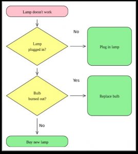
- Flow charts
- Line graphs
When using lists, be sure to also include a brief summary or title of the image you are describing to give context to the data.

Attribution: “Population of Provinces and Territories of Canada Pie Chart” by京市 is under a CC BY-SA 3.0 licence.
A pie chart showing the population of the provinces and territories in Canada as a percent of the national population in 2012. Pie charts

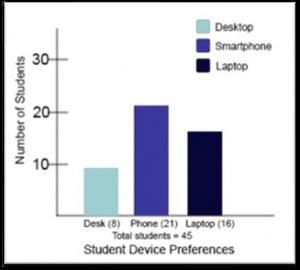
A bar graph comparing student device preferences for desktops, smartphones, and laptops:
- Smartphone: 21 students
- Laptops: 16 students
- Desktop: 8 students
A flowchart of figure out how to fix a broken lamp:
- The lamp does not work.
- Is the lamp plugged in?
- Yes, go to 3?
- No? Plug in the lamp?
- Did bulb burn out?
- a) Yes? Replace
- b) No? Buy a new
Attribution: “Lava lamp flowchart” by Tels~en is under a CC BY-SA 3.0 Licence.

Attribution: “Very Satisfying” by William Little (based on data from Lupri and Frideres, 1981) is under a CC BY 4.0 Licence.
A line graph that shows the percent of husbands and wives in different stages of family life who described their marriage as “highly satisfying.”

Tables
Tables can be used to describe the following complex images:
- Pie charts
- Bar charts
- Line graphs
- Complex tables
Like with lists, be sure to introduce tables with a brief summary or title of the image you are describing to give context to the data. And be sure to follow the guidelines around accessible tables described in section 3.4.
|
Attribution: “Population of Provinces and Territories of Canada Pie Chart” by京市is under a CC BY-SA 3.0 Licnce
A pie chart showing the population of the provinces and territories in Canada as a percent of the national population in 2012

A bar graph comparing student device preferences for desktops, smartphones, and laptops:
|
device preferences |
Number of Students |
| Smartphone | 21 |
| Laptops | 16 |
| Desktop | 8 |
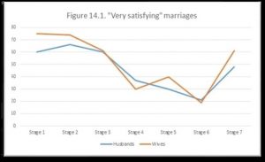
A line graph that shows the percent of husbands and wives in different stages of family life who described their marriage as “highly satisfying.”
Attribution: “Very Satisfying” by William Little (based on data from Lupri and Frideres, 1981) is under a CC BY 4.0 Licence.
| Stage of Family Life | Number of Husbands | Number of Wives |
| Stage 1 Childless | 60% | 75% |
| Stage 2 Children age 0 to 2.5 | 66% | 84% |
| Stage 3 Children 2.5 to 6 | 60% | 61% |
| Stage 4 Children 6 to 13 | 37% | 30% |
| Stage 5 Children 13 to 20 | 30% | 40% |
| Stage 6: Children begin to leave home | 21% | 20% |
| Stage 7: “Empty Nest” | 49% | 61% |
Limitations of Text Descriptions
Visual representations are powerful things. There is a reason why people say, “A picture is worth 1000 words.” Images, diagrams, and graphs can convey a lot of information in a small space, and sometimes it is not possible to translate those visuals into text in a way that provides an equivalent learning experience (Coppin, 2013). In these cases, explore alternative methods like tactile graphics, 3D models, or auditory representations.
For example, here is a possible text description for the following image:
“A visualization that shows the successive losses of men of the French Army in the invasion of Russia from 1812 to 1813. The visualization shows the decreasing number of men over time, the route they took there and back, and the change in temperature over time.”
While that text description provides a brief description of the image, it gets nowhere near being able to provide an equivalent learning experience as the image itself, which is able to connect everything together and show relationships and a lot more detail.

Image description: Described in surrounding text.
Image attribution: “Minard Update” by DkEgy is under a CC BY-SA 4.0 Licence.

Consider what your images would look like if they only displayed in black and white. Would any necessary context or content be lost if the colour was “turned off?” Images should not rely on colour to convey information (W3C, 2018c). If your point requires colour, you may need to edit or format the image so the concepts presented are not lost. You also need to consider the colour contrast. Colour contrast refers to the hue, lightness and saturation of text, images, and background.
Who are you doing this for?
This work supports students who:
- Have poor contrast vision
- Have colour vision deficiency
- Use a device with a monochrome display
- Use a print copy that is in black and white, like Kelly

Image description: A young Black woman sits at a computer wearing a headset, listening.
Image attribution: “Kelly” by the University of Prince Edward Island is under a CC BY 4.0 Licence.
Use of Colour
Here are two versions of the same bar graph that is charting student devices preferences. The right graph uses colour to differentiate between students who prefer desktops, smartphones, or laptops. When the same graph is seen in greyscale, it becomes difficult to tell which bar corresponds with which category. This may be a serious barrier for someone who has a hard time differentiating between colours or someone who has printed their resource in black and white.


This problem can be solved by using colours with higher contrast ratios, and by adding labels to each bar, as shown in the following example. Other methods could include using symbols or different patterns in addition to colour.
Colour Contrast
Whenever you put text- or image-based content on a coloured or textured background, you should confirm that there is sufficient contrast between your foreground content and the chosen background colour or texture.
Students with low vision and/or a form of colour deficiency may have difficulty reading text that does not contrast enough with the background colour selected. If the colour palette you have adopted is too subtle (e.g., white text on a pastel background; medium-grey text on a light-grey background), the contrast between your foreground and background is probably insufficient for some students.
Level AA of the Web Content Accessibility Guidelines (WCAG) requires that text and images of text have a contrast ratio of at least 4.5 to 1 with the background and large-scale text have a minimum ratio of 3 to 1 (W3C, 2018d). The following image presents four different foreground/background colour-contrast examples to illustrate insufficient and sufficient contrast ratios.

Caption: Medium-grey text on a light-grey background; white text on a lime-green background; and red text on a yellow background all provide insufficient colour contrast. Dark blue on a white background provides sufficient colour contrast.
How to determine colour contrast
There are many online and downloadable tools available to help you evaluate colour-contrast ratios. Here are a few we have tried and like:
- WebAIM’s Color Contrast Checker: This web-based tool allows you to select or enter colour values to test and provides you with a “pass” or “fail” on your contrast ratio.
- ACART’s Contrast Checker: This web-based tool allows you to check colour contrast, view your selections in greyscale, keep a history of the colour combinations, and pull colours from an image.
- Giacomo Mazzocato’s Accessibility Color Wheel: This web-based allows you to check colour contrast and will simulate three types of colour blindness. You can also opt to test what your contrast ratio is when the foreground and background colour selections are inverted.
High-contrast mode
Some students need to see light text on dark background for it to be readable, while others require dark text on a light background. Other students may require that content be displayed in high-contrast mode. This can be a subjective experience, based on individual student needs. We recommend testing your text- and image-based content as you go by using high-contrast mode on your own computer and making adjustments as needed.

In Unit 4, we explored different considerations for making images accessible and how to handle colour in educational materials. This included the difference between functional and decorative images, strategies for describing images, including complex images, and a discussion of the use of colour and adequate contrast between colours.
If you are still not sure about how to make images you use accessible, explore the POET Training Tool website. This site provides detailed walkthroughs and guidelines on how to decide when to describe an image, how to describe an image and a place to practice describing images.
Here is an accessibility checklist that can be used to assess the accessibility of images and colour going forward:
Images
- Images that convey information include an equivalent text description of the image’s content.
- Images that are purely decorative or already described in the surrounding text do not have alternative text.
Colour
- Images and text do not rely on colour alone to convey information.
- Foreground and background elements have a minimum contrast ratio of 4.5 to 1 for regular text and 3 to 1 for large text.

1. True or false? An image that is described in the surrounding text does not require an alternative text description.
a) True
b) False
2. True or false? Everyone will be able to read the alternative text descriptions.
a) True
b) False
3. Where can you provide a text description?
a) The surrounding text or caption
b) The alternative text textbox
c) At another location that you are linking to
d) All the above
4. Which option ensures that everyone will be able to read the image description?
a) The surrounding text or caption
b) The alternative text textbox
c) At another location that you are linking to
d) All the above
5. How long should alt text be?
a) A few words.
b) No more than 125 characters.
c) No more than 125 words.
d) There is no length restriction.
6. True or false? Image descriptions are very subjective and may change depending on when and why the image is being shown.
a) True
b) False
7. True or false? Always start alt text with “Image of.”
a) True
b) False
8. What is a possible strategy for describing a complex image or graph?
a) A bulleted list
b) A numbered list
c) A table
d) All the above
9. True or false? Text descriptions always provide an equivalent learning experience as images.
a) True
b) False
10. Which of the following colour combinations does not have a minimum colour contrast ratio of 4.5:1? (Use contrastchecker.com to check.)
a) Foreground: E5E5E5 Background: B63939
b) Foreground: 000000 Background: FFFFFF
c) Foreground: 002F7A Background: FDD3FF
d) Foreground: 13315F Background: 868686
11. Is it every okay to use colour to convey information?
a) No. Colour should be avoided as much as possible.
b) Yes. Colour can be used to convey information.
c) Yes, but colour cannot be the only means to convey information.
d) None of the above.
